Desktop access to the internet is essential for bloggers. We just find it impracticable to create blog posts by using a smartphone or tablet. Yet mobile internet usage is now greater than the desktop usage worldwide, we need to make sure our websites are mobile compatible. One way to make your website mobile friendly for free is to tweak your stylesheet. But that could be quite cumbersome if you’re not a techie. So here are two other options to refresh your outdated websites.

2 Ways To Make Your Website Mobile Friendly For Free
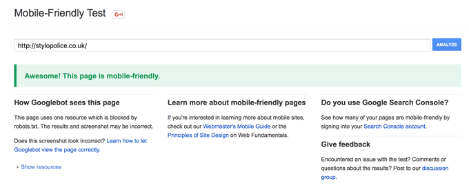
Firstly check if your website is “officially” mobile friendly. There is a Google Developers’ tool function within the Webmaster site.
https://www.google.com/webmasters/tools/mobile-friendly
 Option 1: Change The Theme
The first and the obvious option is to change your website theme to one of the latests.
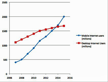
It was during 2014 that mobile exceeded desktop internet usage for the first time in history. It’s been two years since and, we should assume that any website themes that are not mobile responsive have been neglected with essential updates. No doubt such themes would have other functions that are outdated, we should therefore really abandon the use of them now.
In WordPress, changing the theme itself is easy, but you many need a lot of tidying up to do after the change. Most notably layout settings that are different from theme to theme, so following can be expected;
- Header, Footer and Sidebar Settings – new themes likely to have extra options for widgets such as categories, calendar, most popular pages, comments etc. You may need to reshuffle or re-add widgets.
- Header Image – the header size is differently measured from theme to theme, so if you use a header image, you will need to resize it.
- Slider Image – similarly, if you use a slider in your homepage you may find that a new size of images is required.
- Site title, sub-heading and logo – whether you’ve had your site title displayed at the top of the page, the site logo only, or both, with the new theme they’ll be displayed differently at a different position. Your site logo size may need to be adjusted according to the new header size.
- Plugin compatibility – the plugins that you’ve been using may no longer be compatible with your new theme.
- Image positions – because of the site width settings, images may jump out of where you originally positioned.
By all means, changing your website theme is not a quick job. Depending how many pages/posts you already have, you may need a solid day or two to get all the contents up to date.
One of my websites needs updating, but I too find it difficult to spare a time to change the theme. Today I’d like to demonstrate a semi-temporary solution using a plugin, as my option #2.
Option 2: Use WPtouch Mobile Plugin
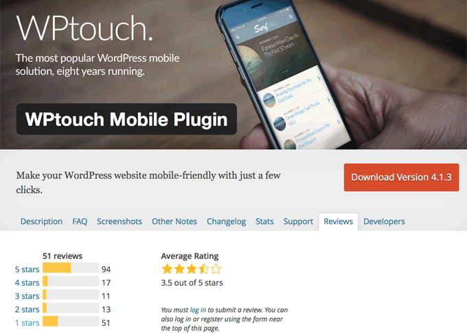
WPtouch is a free WordPress plugin that make your old website mobile-friendly that I’d like to give a try.
WPtouch User Reviews
The user reviews are not that great, as you can see above. As of today (May 21st 2016), 51 users out of 186 have given one star. That’s 27.4%.
However the last two people who gave one star were back in February. One of them said the new update was crashing her site when the plugin was enabled.
There was one person gave two stars in March, said he could not play videos (which I’ve tested after the installation, and embedded YouTube videos seem to work fine).
One person has given 4 stars, and 7 people have rated 5 stars since February. Therefore I assume the problems that some users encountered in February-March time have now been fixed.
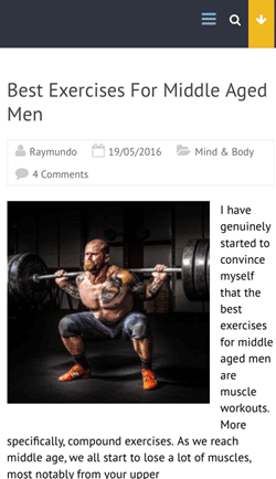
So here is a screenshot of my website that I don’t feel quite happy with.
The picture (of a man lifting a barbell) seems automatically resized, but positioned to the left, leaving the content article to start from the little space to the right.
Sure, they may be a script code to fix this. But overall the page looks quite dull anyway, and I am planning to change the entire site to a new theme in the future. I would like a quick solution for the time being.
Google Webmaster tool that mentioned above recognises this site as mobile-friendly. So it is not a crucial problem, it’s just doesn’t look inviting in my opinion.
So let’s see if I can improve the look of the site on smartphone by using this WPtouch plugin.
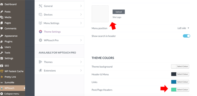
Installed the plugin on my WordPress and activated it.There is a setting screen where you can customise, or upgrade it to Pro version to experiment more, but at this point I did not have to change the setting or do anything else.
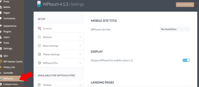
I then checked back the site on my phone and, woah! There was an instant improvement to the look. This was the result;
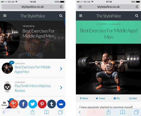
I liked that. Except that this green title background that I wasn’t sure of. But looking a lot better than before.
This background colour can be changed easily on the Theme Setting screen, of course. You can also add your site logo, which I’ve just done now.
…and here it is. The title background colour has now been changed to the site’s base colour (darkish yellow), and the logo is added to the top.
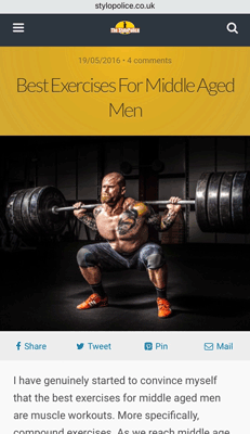
Not too bad, is it?
If you have a WordPress based website with non-mobile friendly theme, I suggest that you should consider changing it to the latest, reputable theme as soon as possible. But using a plugin to make it responsive is definitely a quick solution. WPtouch has done a great job for me.
If you’ve tried it, do let me know how you feel.

Hi, thanks for your review regarding setting your website up for mobile use.
I too thought I’d better up date and chose the Accelerated Mobile Pages, AMP Plugin as this one was advised to me and sounds identical to the WPtouch Plugin you have used.
Fortunately my WordPress theme is adaptable with a mobile plugin as the thought of changing themes and updating every page worried me as I’m rather new to website building.
Installation was very quick, minutes later everything was installed and up to date. I have since checked my mobile performance in Google’s checking software and I received 100% mobile friendliness although the speed was slightly lower so in future I wish to remedy that but will have to learn the steps. Have you checked yours with Google?
Thanks for you mobile friendly article, you are right there’s more traffic going through mobile nowadays and it’s advisable for every website to update.
Thanks,
Simon.
Hi Simon, thanks for sharing your experience and thoughts. AMP Plugin sounds like a great one to convert old WordPress theme to mobile friendly.
I don’t rely on Google (mobile friendly test + speed test) entirely though, these tests are designed especially for developers and, there are some areas that they indicate that we (i.e. ordinary bloggers) cannot easily fix. I use several other sites for loading speeds (How To Speed Up WordPress Site Loading) and, I check the mobile friendliness using my actual phone too.
Mobile optimisation is a must, and now we’re in 2017, we should really use the latest, most updated WordPress theme in my opinion.
Thanks again for your input Simon, I appreciate it!
Raymundo,
Some great tips there on making your blog mobile and tablet friendly. Is configuring the site for tablets automatically done at the same time as mobile configuration, or is a separate option?
I actually like the green back ground!
Amazing information there about mobile usage surpassing desktop. I guess it will only be moving forward!
Thanks for your clear and concise directions.
Cheers, Kris
Hi Kris, thanks for your comment.
That’s a good point, because I no longer own a tablet myself, I can’t check what my site looks like now. However this particular plugin WPtouch is designed only for mobile phones. Enable options for mobile devices and browsers are; iOS (iPod, iPhone), Android Stock & Chrome Browsers, BlackBerry Browser, Firefox OS & Mobile Browser, Windows Phone (IE) and Opera Mobile (Opera on Android/iOS, Opera Mini on iOS, Coast).
Thanks Kris,
Ray
I like how you have in details on how to make sites mobile friendly for others. Nowadays, people are on their cellphones and hate to be on a site that have too much going on and that can drive traffic away. I love that you show the different and understanding about mobile friendly. I agree that the themes, plugins are the main key to have the site mobile friendly and etc. keep it up
Hi “Awesome retail reviews”, thanks for your comment. No I’m not a fan of a website with too much going on either. Especially on a cellphone I tend to get so impatient, I just need a site that I can scroll up and down and read, not from left to right. We’d better be careful especially when we embed script from external source, such as Amazon widget. Thanks for stopping by.