Every website owner wants to increase their user base, and one of the best ways to do this is by converting visitors into subscribers. Subscribers are an invaluable asset for any website as they provide a steady source of engagement, can help spread word-of-mouth marketing, and generate repeat visits.
A good subscription form can make a huge difference; a well-designed and optimized form helps you to capture more leads, generate more sales, and build customer loyalty.
So let’s take a deep dive into tips for maximizing your conversion rate by optimizing your subscription form. Compelling offers? Designing an eye-catching form? What are the best practices? Read on.

What Do You Want From Your Subscribers?
To get a clear vision, it’s good to ask yourself before you do anything: what do you want from your subscribers? Do you aim to increase the number of subscribers on your email list or gather more information about them for targeted marketing campaigns? Know what you want and you will start shaping how you optimize your form quickly.
If increasing the number of subscribers is your goal, consider simplifying and shortening the form. Asking for too much information can be a turn-off for potential subscribers. Instead, focus on collecting only essential data like name and email address.
If gathering more information is a priority, include additional fields in the form but make sure they align with your marketing goals. For instance, if targeting specific demographics is crucial to your campaign's success, include fields that capture demographic data.
Creating a Compelling Offer
Next, think beyond just asking people to sign up. You need to give them a reason why they should subscribe and what they will get in return.
Identify the kind of users (customers) you want them to subscribe to and find out what they’re looking for. What problems are they looking to solve? Once you have that information, create an offer that speaks directly to those needs.
The offer could be in the form of exclusive content such as
- E-books
- Whitepapers
- Webinars
- Discount code
- Free trial of your product.
What you should make sure of are;
- The offer is valuable enough for people to give you their contact information.
- You use clear language when describing the benefits of subscribing so that visitors can quickly understand what they stand to gain from signing up.
- The offer matches the design and tone of your website so that visitors feel comfortable engaging with it.
Take these steps and you'll create an irresistible incentive for people to join your email list and become loyal subscribers.
Don’t Give Away Unrelated Gifts

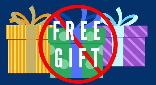
Don't give away a free gift that's too good for anyone but unrelated to your business. Because people who are not interested in your products will just sign up with you, take the gift and never return.
You should ensure that the free gift you're offering is related to your business in some way. For example, if you're selling health supplements, you can offer a free e-book on healthy living or a workout plan. This way, people who are interested in your free gift are more likely to be interested in your products as well.
If you have a say, a free sample to give away, you can make it available only to those who have made a purchase. This way, you're targeting people who have already shown an interest in your business, and you're rewarding them for their loyalty.
Designing the Form
When it comes to designing your subscription form, there are a few key factors that can make all the difference in maximizing your conversion rate.
- Simplicity: Don't overwhelm potential subscribers with too many fields or complicated instructions.
- Keep the design clean and visually appealing: Make use of white space to help guide users' eyes towards the call-to-action button. Use contrasting colors for the button itself to make it stand out even more.
- Social proof: Consider incorporating social proof into your form by including testimonials from satisfied customers or displaying logos of well-known companies you've worked with. This helps build trust and credibility in your brand.
- Mobile responsiveness: Any decent sign-up form template should be mobile-responsive. But you should send the actual page to your cellphone and ensure that your form looks just as good on a phone screen as it does on a desktop. Test out different layouts and formats to see what works best.
- Offer visibility: If you are offering an incentive, make sure it’s prominently displayed within the form itself so users are enticed to sign up right away!

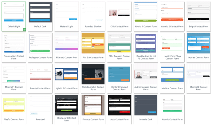
Contact Form Templates by Thrive Architect
Use a Subscription Form Builder
Using a subscription form template that comes with your email marketing service typically does not look as professional or polished as creating one from scratch. These templates often come off looking tacky and unappealing, which could lead to fewer people signing up for your mailing list.
Instead of relying on a subscription form builder, usually comes with your landing page builder. Thrive Architect, for example, provides professional as well as modern-looking form templates.
Take some time to create a custom signup form that looks more inviting and is tailored to fit the aesthetic of your business. Doing so will help you attract more subscribers and ensure they have a pleasant experience when signing up for emails from you.
Don't Ask For Phone Number In Your Form
While asking for basic contact details like name and email address is a common practice, requesting phone numbers can be a major turn-off for some people. Mainly because;
- Not many users feel comfortable sharing their personal phone numbers with an unknown business or website. Privacy concerns are becoming increasingly prevalent in today's digital age and some may view providing their phone number as an unnecessary intrusion.
- Asking for too much information on the subscription form can also make it appear daunting and time-consuming. Users want quick and simple solutions when signing up for newsletters or updates. By limiting the amount of data required on the form, you create a more streamlined experience that encourages conversions.
Instead of relying on phone numbers as another means of contacting subscribers, focus on other communication channels such as social media platforms or messaging apps. Offering alternative ways to stay connected can still provide valuable touchpoints without risking subscriber loss due to privacy concerns or lengthy forms.
Copywriting Tips

The copywriting on your subscription form can make or break your conversion rate. Here are some tips to help you create compelling and effective copy that will convince visitors to sign up.
Here are some copywriting tips to optimize a sign-up form:
- Use clear, everyday language: The language you use on your sign-up form should be easy to understand and concise. Avoid using technical jargon or complicated words that could confuse users.
- Highlight the benefits: Make sure to clearly outline the benefits of signing up for your service or product. This could be in the form of bullet points or a short paragraph that emphasizes how your product or service can help the user. Will they get exclusive content? Special promotions? Early access to new products or services? Make sure the benefits are front and center in your copy.
- Create urgency: Use language that creates a sense of urgency to encourage users to sign up immediately. This could include phrases like "limited time offer" or "sign up now to secure your spot."
- Keep it short and straightforward: Don't overwhelm visitors with too much information or unnecessary details. Stick to the essentials and convey them clearly.
- Use social proof: Use customer testimonials or social proof to build trust with users and make them more likely to sign up. If you have testimonials from satisfied customers who have benefited from being on your email list, include them in your copy.
- Call to action: Don't forget about the importance of visual appeal when it comes to copywriting. Use a clear and compelling call-to-action that encourages users to sign up. Use action-oriented language such as "Get The Info Now" or "Start Today!"
- Assure privacy: Assure users that their personal information will be kept confidential and will not be shared with third parties. This can help build trust and increase sign-up rates.
- Use visual cues: Use visual cues like arrows or bold text to draw attention to the most important elements of the sign-up form, such as the call-to-action or the benefits of signing up.
Testing and Analyzing Results

After designing and launching your subscription form, the work isn't done yet. It's important to test and analyze the results to see how well your form is performing.
Sign Up With Yourself
Testing the sign-up form before launching your newsletter is an important step that should not be overlooked; this will help ensure that once you launch it, potential subscribers can easily join.
Signing up with your own newsletter allows you to walk through the process and make sure everything works as expected. Additionally, being able to review how each individual step looks from a subscriber's perspective helps ensure all information is clear and easy to understand.
A/B Testing Tool
One useful tool for testing is A/B testing, where you create two versions of your form with one variable changed between them (such as button color or wording) and track which version gets more conversions.
Most reputable email marketing services are equipped with powerful analyzing tools that help marketers to track and measure their campaigns. These tools provide essential insights into key performance metrics such as open rates, click-through rates, conversion rates, bounce rates and more. This helps marketers to understand which emails are performing well and what needs to be improved in order to reach their desired goals.
Additionally, most of these services offer detailed reporting capabilities that include segmentation based on geographical location or other factors for further analysis. With these advanced analytics capabilities, it is easy for companies to optimize their email campaigns for higher engagement and better returns on investment.
Keep track of these metrics over time so that you can identify any trends or changes in user behavior. For example, if you notice a sudden decrease in conversion rates after changing something on your website, it may be worth investigating further.
Regularly testing and analyzing the results of your subscription form will help you make informed decisions about optimizing it for maximum conversions.
Maximize Your Conversion Rate: How To Optimize Your Subscription Form - Final Words
Optimizing your subscription form is essential for maximizing your conversion rate. By following the tips outlined in this article, you can create a compelling offer, design an attractive and user-friendly form and write persuasive copy that encourages visitors to subscribe.
Remember to always test and analyze the results of any changes you make to your subscription form. This will help you identify what works best for your audience and fine-tune your strategy over time.
Ultimately, the key to success lies in understanding what motivates your subscribers and providing them with valuable content that meets their needs. By doing so, you'll not only increase conversions but also build a loyal base of followers who are eager to engage with your brand.


