Business owners often watch their traffic numbers rise while their bank accounts stay painfully stagnant. This situation feels like throwing a party where everyone shows up but nobody drinks the punch. You spend thousands on ads only to see visitors bounce within three seconds. The digital world is a harsh reality for anyone who ignores the science of persuasion.
Conversion rates are the lifeblood of your online existence. A low number suggests a disconnect between what you say and what people want. My history with websites taught me that small tweaks create massive shifts in revenue. You should treat your landing page like a high-stakes poker game. Every pixel is a bet that you either win or lose. Success requires a blend of psychology and cold, hard data. Prepare to strip away the fluff and look at the gritty reality of sales. This is the path to turning clicks into cash.
The Psychological Warfare of the Buy Button
Color choices on a website often trigger subconscious reactions that people cannot explain. You should avoid the urge to pick a shade just because it looks pretty. Red often screams urgency while green suggests a safe path forward. Contrast is the real hero in this particular battle for attention. A button should stand out like a neon sign in a dark alleyway.
Size determines the level of attention a visitor pays to your call to action. You should make the button large enough to find but small enough to respect the layout. People click on things that look like they belong in a physical space. Rounded corners often feel more clickable than sharp, clinical edges. Your design choices speak to the primal brain before the logic kicks in.
Text on the button changes the way a user perceives the value of the click. You should swap generic words for something that describes the actual result. Action verbs create a sense of movement that passive words lack entirely. The goal is to make the click feel like a natural next step. Personalize the message to make the reader feel like the center of the world.
Change the color of your primary button to something that clashes with the rest of the page.
Increase the white space around the button to make it pop off the screen.
Use first-person language like "Start My Trial" to increase the sense of ownership.
Friction Removal and the Path of Least Resistance
Complexity is the silent killer of every online transaction. You should count every single click it takes to get from the landing page to the receipt. Every extra step is a hole in your bucket where money leaks out. People possess a very short fuse when they try to spend money. Your job is to pave the road until it feels like a slide.
Links that lead nowhere or confusing menus create mental blocks for the visitor. You should remove any distractions that do not help the person finish the task. Sidebars often act as exit ramps for people who were ready to buy. A clean interface tells the brain that the process is safe and easy. Minimalism is a strategy for profit rather than just a design trend.
Decision fatigue hits your customers harder than you realize during the checkout process. You should limit the number of fields in your contact forms to the bare minimum. Every question you ask creates a moment of hesitation in the mind of the buyer. Hesitation is the precursor to an abandoned cart and a lost sale. Streamline the experience until it feels like the site is reading their mind.
Remove the navigation menu from the checkout page to prevent people from wandering off.
Implement a one-click purchase system for returning customers to speed up the deal.
Display a progress bar so people see exactly how close they are to the end.
Headline Hooks and the Art of the Grab
Headlines act as the primary gatekeeper for your entire sales funnel. Most visitors read the large text and decide to stay or leave in an instant. You should avoid being vague or overly poetic with your opening statement. People want to know exactly what is in it for them within seconds. Clear value beats a clever pun every single day of the week.
Curiosity is a heavy hitter when you want to keep someone on the page. You should ask a question that makes the reader feel a bit uneasy about their current situation. Solutions should appear as the only logical answer to the problem you just described. This creates a mental itch that only your product is able to scratch. Your words should hit like a physical weight on the chest.
Verbs should lead the way in every sentence you write for a headline. You should tell the reader exactly what to do next without any hesitation. Soft language creates soft results in the world of digital marketing. Strong claims require bold fonts and a lack of qualifiers. The headline is the promise that the rest of the page must keep.
Use a large font size for the main benefit so it is the first thing eyes see.
Test a headline that focuses on the pain of the problem rather than the solution.
Keep the word count low to ensure the message hits with maximum velocity.
High-Conversion Hooks for the Home Office
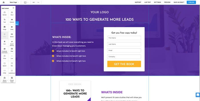
You run an empire from a desk that also hosts your morning cereal. This lifestyle is a high-wire act where the laundry hums and the profits wait for nobody. These headlines target the particular pain of the solo operator to help you look like a pro. They promise more cash and less stress without the need for a fancy office lease.
Scale Your Monthly Revenue Without Sacrificing Your Family Time.
The Blueprint To Turn A Spare Bedroom Into A Six-Figure Empire.
Stop The Trade Of Hours For Pennies And Start Selling Your Value Today.
Professional Results From A Kitchen Table - The Only Plan You Need.
Replace Your Day Job Salary Within Ninety Days Or Less.
The Chaos of Choice and the Rule of One
Too many options will paralyze a potential buyer before they even start. You should give people a single path to follow to reach the finish line. Multiple calls to action compete for the same limited amount of mental energy. The brain shuts down when it faces a wall of equally appealing choices. One clear directive is the secret to a high conversion rate.
Bundles often help to simplify the decision-making process for the weary shopper. You should group products together to make the choice feel like a no-brainer. People prefer to be told what is best for their current needs. Your expert recommendation carries more weight than a list of fifty items. Selection is a service that you perform for the customer.
Navigation menus should stay simple and avoid overwhelming the user with links. You should hide secondary pages in a footer or a sub-menu. Primary real estate is for the things that actually move the needle for your business. Clutter is the enemy of a focused mind and a full cart. A clean layout directs the eye toward the goal without any friction.
Highlight a "Most Popular" option to guide people toward a particular selection.
Limit the main menu to five items or fewer to prevent visual noise.
Remove social media icons from the header so people stay on your site.
Trust Signals That Do Not Look Like Lies
Genuine signals of trust are the bedrock of any successful online sale. You should avoid using stock photos of people in suits shaking hands. Real faces and real names create a sense of safety for the skeptical visitor. People look for clues that your business is a living, breathing entity. Your reputation is on the line with every single pixel you display.
Security badges should appear near the checkout button to calm the nerves. You should use recognizable logos from payment processors and security firms. These icons act as a silent guarantee that the credit card info is safe. Anxiety is the primary reason why people abandon a purchase at the last second. Small visual cues are able to lower the heart rate of a worried buyer.
Guarantees take the risk away from the customer and place it on your shoulders. You should offer a clear money-back promise that is easy to find. This safety net makes the decision to buy feel much smaller and less scary. People are more likely to commit when they know they have an out. A bold guarantee shows that you have absolute confidence in your product.
Display a live feed of recent purchases to show that other people are buying.
Feature a photo of your actual office or team to prove you are a real company.
Place a phone number or a chat box in a visible spot to show you are reachable.
Speed of the Site and the Cost of Waiting
Seconds feel like hours when a website is loading on a slow connection. You should optimize every image until it is as small as possible. A delay of three seconds is enough to lose half of your potential traffic. Search engines hate slow sites and your customers hate them even more. Speed is a feature that directly impacts your bottom line every day.
Scripts and plugins often bloat the code and slow down the entire experience. You should audit your backend regularly to remove anything that is not useful. Every millisecond counts when you are fighting for a conversion. Mobile users are especially sensitive to pages that take too long to appear. Technical debt is a weight that drags your conversion rate into the dirt.
Server choice is not a place where you should try to save a few pennies. You should invest in a server that is able to handle spikes in traffic without crashing. Fast response times make the site feel snappy and professional. A sluggish page suggests a lack of care for the user experience. Performance is a silent salesman that never takes a day off.
- Compress every JPG and PNG file before you upload them to the server.
- Use a content delivery network to serve files from a location close to the user.
- Minify your CSS and Javascript files to reduce the amount of data sent.
Layouts for Mobile That Honor the Human Hand
Desktops are now the secondary way that people interact with the internet. You should design for the thumb before you design for the mouse. Buttons need to be large enough to hit without touching the wrong link. Tiny text is a physical barrier for anyone over the age of thirty. Your mobile site should feel like a native app rather than a shrunken website.
Content should stack in a way that makes sense for a vertical screen. You should avoid horizontal scrolling like the plague it truly is. Information should flow downward in a logical sequence that builds desire. Fingers are less precise than cursors, so give the user plenty of room. A cramped layout leads to accidental clicks and immediate frustration.
Features like click-to-call make the mobile experience much more functional. You should prioritize the actions that people take when they are on the move. Map links and quick contact forms are the heroes of the mobile world. People want answers quickly when they are staring at a small screen in their palm. Efficiency is the name of the game for the modern smartphone user.
- Test your site on multiple devices to ensure the layout remains intact everywhere.
- Move the call to action button to the bottom of the screen for easier access.
- Ensure that popups are easy to close with a single tap of the finger.
Sales Copy That Sounds Like a Late Night Talk
Formal language is a great way to make people fall asleep on your site. You should write like you are talking to a friend over a drink. Slang and contractions make the text feel human and relatable. Avoid the temptation to use big words that make you sound like a textbook. Your voice should be the most distinctive thing about your entire brand.
Stories bypass the logical filters of the human brain. You should describe the results of your product in vivid and visceral detail. People buy feelings and status rather than just features and specs. Use words that trigger the senses and create a mental movie for the reader. The narrative you build is the most persuasive asset you possess.
Questions are a great way to keep the reader moving down the page. You should use a conversational tone that invites the person into a dialogue. This makes the experience feel less like a pitch and more like a discovery. Every paragraph should end with a reason to read the next one. Momentum is the secret sauce of a high-converting sales letter.
- Read your copy out loud to find any sentences that sound stiff or robotic.
- Use "you" and "your" more often than "we" or "our" to keep the focus on them.
- Break up long blocks of text into short sentences and tiny paragraphs.
Micro-Conversions and the Power of Yes
Small commitments pave the way for the big sale at the end of the funnel. You should ask for a tiny favor before you ask for the credit card. An email sign-up is a low-stakes way to start a relationship with a stranger. Each small "yes" builds a momentum that is hard to stop. Psychology shows that people like to remain consistent with their previous actions.
Quizzes and polls are excellent ways to get people to interact with your site. You should offer a personalized result in exchange for a few seconds of their time. This data helps you segment your leads and talk to them with more precision. Interactive elements make the visitor feel like they are part of the process. Feedback from these interactions is a gold mine for future improvements.
Freebies and samples are the classic way to prove your value without any risk. You should give away a piece of the solution for free to build some goodwill. This creates a sense of reciprocity in the mind of the potential buyer. They feel a slight obligation to return the favor by making a purchase later. Generosity is a very profitable strategy when it is done correctly.
- Create a checklist or a cheat sheet that solves a small but annoying problem.
- Ask visitors to vote on a new product feature to get them invested in the brand.
- Offer a free shipping code in exchange for a newsletter subscription on the spot.
Cost Tables That Do Not Scare People
Confusion in the pricing section is the fastest way to kill a conversion. You should make the cost of your product as clear as a summer day. Hidden fees and surprise taxes are a betrayal of trust that people never forgive. Tiered pricing helps different types of buyers find a home on your site. The layout should make the best value option look like the obvious choice.
Comparisons are a great way to show how much more you give than the competition. You should list the features of each plan side-by-side for easy reading. Checkmarks are a universal symbol for "yes" that the brain loves to see. Avoid listing fifty different features that nobody actually cares about. Focus on the three things that make the biggest difference in their lives.
Currency and payment options should match the location of the visitor. You should display the local price to avoid making the user do math in their head. Installment plans make a large purchase feel much more manageable for the budget-conscious. Flexibility in payment is a sign that you value the customer's financial situation. The checkout process should be a celebration rather than a moment of regret.
- Highlight one pricing tier with a different color to draw the eye toward it.
- Use a "per month" price even for annual plans to make the number look smaller.
- Include a frequently asked questions section right below the pricing table.
Testimonials That Prove Your Worth
Empty praise from "Customer A" is a waste of space on your landing page. You should use real names, real titles, and real photos for every quote. Detail is the key to making a testimonial feel like a true story. People want to see the "before" and "after" of the experience with your product. A good testimonial should address a common objection and destroy it.
Video reviews carry a level of weight that text simply cannot match. You should encourage your best customers to record a quick clip on their phone. The sound of a human voice and the look in their eyes builds massive trust. Genuineness shines through in a way that polished marketing copy never manages. These clips act as a social proof that is impossible to ignore.
Social media mentions and screenshots are a great way to show real-world buzz. You should curate a "wall of love" that shows people talking about you in the wild. This looks less like a staged advertisement and more like a movement. Third-party validation is worth more than any claim you make about yourself. Let your customers do the heavy lifting when it comes to persuasion.
- Ask customers for a quote that mentions the exact result they achieved with you.
- Feature a testimonial from a person who was skeptical at first but is now a fan.
- Link to a public review on a site like Trustpilot to prove the quote is real.
Invisible Upsells and the Psychology of More
Sales do not have to end once the customer clicks the buy button. You should offer a complementary product right at the moment of peak interest. Additional sections are a classic way to increase the average order value. This works because the customer is already in a "yes" mindset. The suggestion should feel like a helpful addition rather than a pushy pitch.
The act of bundling related items together at a slight discount is a win for everyone. You should show the math of how much the person saves by buying the set. This appeals to the part of the brain that loves a good deal and hates missing out. Convenience is a major driver of these additional sales during the checkout flow. Make it a one-click process so the friction remains at zero.
Post-purchase offers are a great way to keep the momentum going after the sale. You should show a special deal on the thank-you page that is only for new buyers. This creates an exclusive feeling that makes the customer feel like a VIP. The deal should be relevant and add value to the thing they just bought. Timing is everything when you are asking for more money from a happy client.
- Add an "order bump" checkbox to the checkout page for a small add-on item.
- Show a countdown timer for a special deal that expires in ten minutes.
- Send a follow-up email a week later with a discount for a second purchase.
Form Streamlining for the Impatient Buyer
Fields in a form are like hurdles in a race that the user must jump over. You should remove any question that is not a requirement for the transaction. Asking for a phone number or a middle name often leads to an immediate exit. Every blank box is a moment where the user might change their mind. Keep it short, keep it simple, and keep it moving.
Labels should stay visible even after the user starts typing in the box. You should use floating labels that move out of the way but stay on the screen. This prevents the user from forgetting what they were supposed to put in the field. Errors should appear in real-time so the person can fix them immediately. Nobody wants to hit submit only to be told they made a mistake three pages ago.
Automatic fill and address lookups are a godsend for the busy person on the go. You should use technology that helps the user complete the form with fewer keystrokes. Saving time for the customer is a great way to show that you respect their day. Small conveniences add up to a much higher conversion rate over time. A smooth form is a sign of a professional and thoughtful business.
- Use a single field for the full name instead of splitting it into first and last.
- Enable a progress bar for multi-page forms so the end is always in sight.
- Allow users to sign in with social media accounts to skip the form entirely.
Exit Logic and the Last Chance Saloon
Visitors who are about to leave your site are not a lost cause yet. You should use exit-intent popups that trigger when the mouse moves toward the close button. This is your final chance to make an impression and save the sale. The deal must be strong enough to stop someone in their tracks. A massive discount or a high-value freebie is usually the best bet.
Copy on an exit popup should be bold and perhaps a little bit cheeky. You should call out the fact that they are leaving and ask them why. Questions like "Wait! Don't go empty-handed" are a classic for a reason. Humor is able to break the tension of a sales process and make you feel more human. Your goal is to get their email address even if you do not get the sale.
The strategy of targeting these popups based on the page the user is viewing is a smart move. You should show a different message for a blog post than you do for a checkout page. Relevance increases the odds that the person will actually interact with the offer. Treat this as a safety net that catches the people who were about to fall away.
- Offer a "buy one get one free" deal that is only available on the exit popup.
- Ask a single-question survey to find out why the person decided not to buy today.
- Give a coupon code that is valid for the next twenty-four hours only.
Color Theory Beyond the Basic Rainbow
Colors do more than just make a website look pretty for the owner. You should see how different hues impact the mood of the visitor. Blue creates a sense of trust and stability that works well for banks and lawyers. Yellow grabs the eye but can cause eye strain if you use too much of it. Every color sends a signal that the brain decodes without the user even knowing.
White space is the most underrated color in your entire design palette. You should use plenty of empty space to let the key elements breathe. Cluttered pages look cheap and make it hard for the user to focus on the goal. Space is a sign of luxury and confidence in the quality of your message. Give the eyes a rest so the brain can focus on the buy button.
Contrast between the background and the text is a mandatory requirement for readability. You should avoid light gray text on a white background at all costs. Making the visitor squint is a great way to get them to close the tab. High contrast ensures that your message hits the brain with zero effort from the reader. Clarity in design leads directly to clarity in the mind of the buyer.
- Use a bright color for your call to action that does not appear anywhere else.
- Stick to a palette of three main colors to keep the design looking professional.
- Check your colors for accessibility to ensure everyone is able to read your site.
Anxiety Reduction and the Security Blanket
Buyers always have a voice in the back of their head telling them to stop. You should address these fears before the customer even has a chance to voice them. FAQ sections are not just for information; they are for psychological reassurance. Answer the questions about shipping times, return policies, and hidden costs up front. Knowledge is the antidote to the fear that keeps people from clicking buy.
Proof is a heavy hitter when it comes to lowering the collective blood pressure. You should show that thousands of other people have already taken the leap. Reviews and ratings give a safety-in-numbers feeling that the brain loves. We are social animals who prefer to follow a well-worn path. Your success stories act as a lighthouse for the people still lost at sea.
Chat and visible support options show that you are not a faceless corporation. You should make it easy for people to reach a human being if they get stuck. Knowing that help is just a click away makes the process feel much safer. Anxiety melts away when a person realizes they are not alone in the transaction. Be the friendly face that guides them through the dark forest of the internet.
- Place a "Verified Buyer" badge next to reviews to increase their credibility.
- Offer a chat bubble that pops up after a user spends two minutes on a page.
- Show the logo of a charity you support to show you have a soul.
Boosting Failing Conversion Rates
Successful conversion rate optimization is a continuous process of testing and learning. You should never assume that your first version is the best it will ever be. Small changes in wording or color have the ability to double your income overnight.
Data is the only truth that matters in the world of online sales. You must listen to what the visitors do rather than what they say. The digital landscape changes every day, and your site must adapt to keep up. Take these techniques and apply them to your own business with a sense of urgency. Your bank account will thank you for the extra attention to detail.
Every click is a story, and you are the author who decides how it ends. Be bold, be clear, and never stop improving your craft.
How I "Finally" Make Over $7,000 Monthly Income
"The most valuable thing I've ever done!"

Hey, awesome post here. I’m planning to start an e-commerce site later on this year and the information helps to start me up a big deal. Look forward to your future posts. Kaju
Pretty good advice for me thanks. I Particularly agree about coupons I receive from super-market. If they are not for food I never usually buy they are never useful but thankfully they are very clever almost all the coupons are for food I often bought in the past few months. My question is, I want to start my own ecommerce store but I have no idea what kind of software can do that? I appreciate if you can recommend one I can take a look. Thanks.