In modern business, your website will more often than not be the first point of contact your customers and would-be customers have with you, so the more you can do to make sure it's on point, the more business you are likely to convert.
Trends in both the design and functionality of websites have changed a lot in the past few years, with most modern sites favoring very clean, minimalist homepages and easy navigation over homepages crammed with many different products, features, images, and messages. If you haven't given your site a revamp in a while, you could well be falling behind the times and giving your customers a less inspiring experience than your competitors.
Here we look at some of the ways you can upgrade your site in everything from look and branding to functionality and user experience, with some examples of sites that do these things well:

1. Optimize for Mobile
Google began penalizing non-mobile-responsive websites way back in 2015. They rolled out an update, often called "Mobilegeddon," which was a game-changer. Before this, whether your site looked good on a phone or not didn't impact your Google search rankings much. But post-2015, if your site wasn't mobile-friendly, Google was like, "Nope, you're not getting to the top of my search results."
Consequences of Not Being Mobile Friendly
So, what happens if your site is stuck in the desktop-only era? Let's break it down:
Search Engine Rankings Drop: The most direct impact is on your Google search rankings. If someone's searching on their phone, and your site isn't mobile-friendly, Google will likely place it lower in the search results. It's like throwing a party and not inviting mobile users.
User Experience Suffers: Imagine trying to navigate a desktop site on your phone. It's frustrating, right? Users are likely to bounce off your site if it’s not easy to use on their device. And trust me, user experience is a big deal.
Lost Traffic and Revenue: Lower rankings and a bad user experience mean fewer visitors, and potentially, less revenue. It's a domino effect – bad mobile experience leads to fewer visitors, which leads to fewer conversions and sales.
Poor Brand Perception: If your site isn't mobile-friendly, it can make your brand look outdated. It's like still using a flip phone in the age of smartphones. Not a great look.
Competitive Disadvantage: In today's market, most of your competitors are likely mobile-friendly. Not keeping up puts you at a significant disadvantage.
Why You Should Care
Honestly, in this age, having a mobile-responsive site is non-negotiable. Most web traffic comes from mobile devices now. So, if your site isn’t up to par, you're missing out big time. Google isn’t just being mean; they’re reflecting user preferences. People want sites that work well on their phones, and Google is saying, "Alright, if you want to play in my yard, you’ve got to follow these rules."
2. Make Navigation Easy
When people visit a website, one of the biggest frustrations can be not being able to find what they want from the homepage at a glance. There are certain conventions people expect to see, such as navigation to things like legal information and FAQs right at the bottom of the page in the footer, and search facilities typically being somewhere around the top right of a page, but other than that, it is down to your site's design to get them to the features or information they want quickly.
This can even be done in a stylized way if it suits your business, for example, the homepage for Avoriaz Ski Resort uses a stunning 360 image of the location itself with points you can click on for things like bookings and packages. This creates a unique look that shows off the resort while also making the most popular features of the site easy to find.
3. Keep Decision Making Simple

If you have one main call to action you are prioritizing with your website, for instance, having people get a quote, sign up for a trial, or get straight in and browse your catalog, then it is best to have this as the central call to action on your homepage, rather than offering all of the features your site has at once.
This makes it easier for customers to make the yes or no decision about whether to follow the call to action, rather than having various options available on the homepage to choose from, some of which will be of a lower priority to you. Of course, navigation to other things people can do on the site should still be clear and easy to follow, as per the previous point.
A site that does this well is Shopify, which asks users on the homepage to submit their email address to start a free trial. This is their main way of onboarding new customers, and so someone doing this is their best outcome for a visit. Of course, people can still easily navigate to learn more about their services and pricing, and can contact them, but the uncluttered homepage makes signing up for a trial a simple decision.

Shopify Homepage
4. Use Negative Space in Your Design
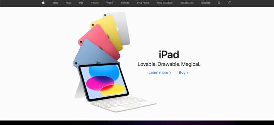
Now for a visual design tip that many major businesses use to really highlight their flagship products or their most crucial messaging on their homepages. Make good use of the negative space on the first page your visitors see. This means the blank areas of the page, which will be in whatever color the background of your palette is, though the effect tends to be most striking with a white background. This really brings the visitor's eyes to the product you display and any catchy, minimal slogan or call to action text you're using.

Apple Homepage
This is used extremely well on the homepage for Apple. While they do change the product featured on the homepage depending on what their latest offering is, the first thing you see on their site is usually a beautiful high-quality image and snappy description of the product in question, surrounded by nothing but sharp white space.
5. Show Off Your Happy Customers

Showing testimonials as people scroll down from the main message of your homepage is a great way to not only shine a light on the solutions your business provides from a customer perspective, but also to help you to look established and successful.
If you are a business-to-business company, then using brand logos from your most recognizable clients can be a great way to put this across visually, and you can even use this to link to more detailed case studies about how you are helping the company in question elsewhere on your site. Alternatively, if you sell to consumers, showing testimonials or positive reviews helps give new customers reassurance that they are going to have a good experience if they buy from you.
A B2B site that does this well is Salesforce's website, which shows some of its most prestigious customers with details about how their solutions have helped them to thrive.
6. Allow for a Custom Experience
If your site is of the type where people are likely to create accounts and login regularly - for instance an ecommerce or social media type site - then allowing for registered users to see a custom version of the homepage not only gives them a more convenient way to use it, but also lets you promote the things most relevant to them.
The king of this is of course Amazon, but even without their huge volumes of sales data to go on, it is still possible for you to make custom recommendations and allow users to do things like create wish lists on your site.
As you can see, everything from visual layout and site navigation to calls to action can be refined and improved on your site to make it perform better both for your customers, and for your bottom line.
