The next step of this simple WordPress tutorial for beginners is to skip all the complex bits. Because the purpose of this lesson is to get you to start your WordPress blog site as simply as possible.
There are a lot of settings to think about - menus, layouts, user settings, plugins (!), etc. But the technical stuff can be done later because ideally, don’t you want to publish your first blog post as quickly as you can without getting bogged down with complicated settings?
Start Writing Regardless
…Or not? You may be a perfectionist, wanting to become familiar with every part of the WordPress admin dashboard before putting anything out in the public. However, the thing is, it will take your brand new website at least a few days to be found, crawled, and indexed by Google. Virtually no one will find your posts for a while, so my idea is to build the actual content and shape up the format little by little simultaneously.
So let’s start with the minimal basics.
“Posts” or “Pages”
To start writing, you go to either “Posts” or “Pages” in the side menu. And perhaps the first thing you want to clear about is the difference between these two.
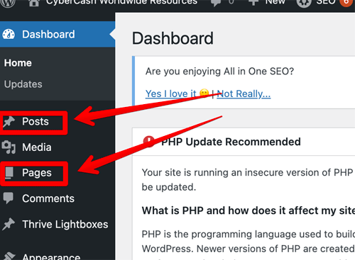
You may know this already if you’ve used other blogging platforms like Blogger. In short, “Posts” are essentially for blog posts. Whereas “Pages” should be used to publish static content.
For example, if you have a bread recipe website, you’ll be publishing recipe after recipe, using “Posts.” You may have other information such as the latest news and announcements, your opinions… Basically whatever you want to publish right now.
“Pages” on the other hand, should be used to display the basic information about you and your site, such as;
- “About Me”, “Where To Find Us”, “Contact Me”
- Landing page (homepage) - introduction to your website, a lead capture form (“Sign up for my weekly newsletter”)
- Legal pages such as “Privacy Policy” and “Terms and Conditions”.
You can also use “Pages” to publish static/evergreen content that underlines your website niche. There are some pieces of information that you may want to publish either using a Post or Page. For a bread recipe website example;
- Basic bread recipe
- Allergy information
- Recommended utensils or bakeries
You don’t have to be too worried about it though. If you think these pieces of information are absolutely essential for your readers, then you can use Pages. Or you can publish them as part of your blog posts. Especially recommended products may change over time, so I would personally use Posts. But if you feel it’s evergreen, then use Pages…it’s up to you.
If you think you’ve made a mistake by publishing something as a post where it should have been a page, or vice versa, you can always switch it using a plugin (see Post Type Switcher)
Summary: To publish static/evergreen/basic information content, use a "Page". To publish blog content (latest updates), use a "Post".
Annoying Full-Screen Mode
By the way, when you click "Add New" post or page, and if the left-hand menu suddenly disappears...

That's only because it's in the full-screen mode.
Click the right-hand corner (the three vertical dots - you may have to click it twice or more), and…
Uncheck where it says “Fullscreen Mode”

The side bar should reappear.
Title a Post/Page and Save Draft
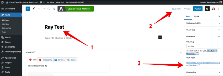
The first thing you do is to name a post (or page), make sure you're happy with the permalink (URL of that particular page), and save draft.
Here's what I've done - simple.
- 1Set the page title (I named it "Ray Test")
- 2Click "Save Draft"
- 3The permalink will automatically be set as https://resources.cybercashworldwide.com/ray-test
You can also set the page title and URL differently.
In this example, I still want to name the page "Ray Test", but I want the URL to be https://resources.cybercashworldwide.com/wordpress-ray
Then what I need to do is to simply retype the permalink box; wordpress ray
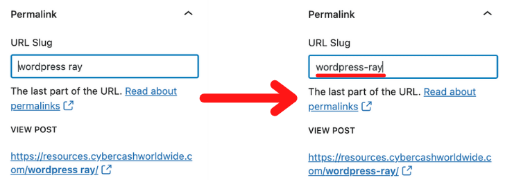
A hyphen will be added automatically in between each word, creating a URL https://resources.cybercashworldwide.com/wordpress-ray
Don't forget to save the page again (Save Draft), and the title and URL are sorted.
Summary: Before you do anything, create a page/post title, make sure you're happy with the URL, and save draft.
The Visual Editor!
Now open the visual page editor (Thrive Architect) and start adding content.

Simple as Ikea assembly instruction... Click the green button. A new browser should open. (It might take 10-20 seconds.)
Thrive Architect works exactly the same way on a Post or Page, so all the procedures will be the same.
…Except that with a Page, you can create several different types of layouts. Whereas with a Post, there’s only one standard preset format.
So when you open Thrive Architect on the “Page”, an option window will pop up, prompting you to choose which type of page you want to create;
- Normal Page - This is a standard Page format. Go for this one for any general use.
- Blank Page with Header and Footer - Only if you specifically want this style.
- Completely Blank Page - Only if you specifically want this style.
- Pre-Built Landing Page - This is useful when you want to create a special landing page. A sales page for a specific product, a lead capture (“sign up with a newsletter”) page, etc. There are hundreds of fabulous pre-made templates for various purposes. We’ll come to this later on.
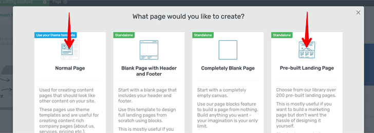
You’ll be using 1 (Normal Page) mostly, and 4 (Landing Page) for any special purpose.
In this example, I'll choose Normal Page. The Thrive Architect visual page editor will look like this;
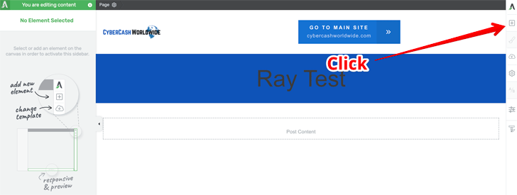
First, click the [+] sign at the top-right hand corner.
- 1A box of lot of feature icons will come up. Text, image, button, table... Google Map...Twitter feed... Contact Form...
- 2Just choose one of the icons and drag it to the web space.
If you don't drag it and simply click an icon, the feature will always be added to the bottom of the page.
Why don't you create a test page and play around with it?
As long as you save draft and don't publish it, no one will see it. Why don't you name the page "1" (one) or "AAA"...so that your draft page will stay on top of the list (under "Pages" menu) so you can easily come back, open again, play around with it, edit/save/delete.
The Visual Editor Continued
Ok, look. I've just dragged & dropped a text box.
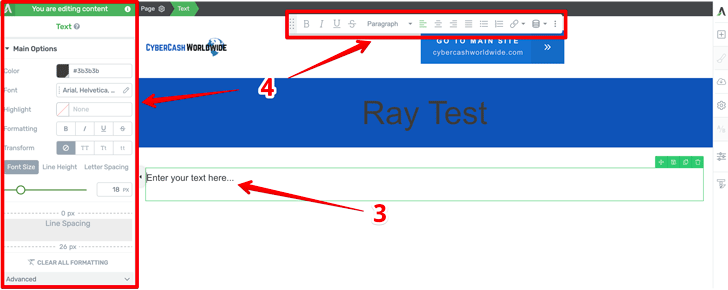
- 3Here, you can start typing. Or copy & paste text from elsewhere.
- 4As soon as you click this text area, the feature icon box on the right-hand side will disappear, and two control boxes will appear instead.
These two control boxes are...
- The top menu is as you can see, where you change it to bold/italic, left/middle/right indent, etc. This is also where you place a hyperlink as well. Highlight a text and click the clip icon
- The left menu allows you to change a few more in detail, should you want to. Font size...font color... If you want to add a border around your text box, etc.
Also...
Take a look at towards the bottom of the editor.

- 5Here, you can view (a) Desktop view (b) Tablet view and (c) Mobile view. You're working on a desktop/laptop right now, but it's important to make sure that your webpage looks as good on a tablet and a mobile device as well. These view options allow you to see how the other device formats will look like.
- 6The [Preview] button will open a new browser tab, allowing you to preview your work. You need to Save Work (8 below) before preview.
- 7There's Undo button at the bottom-left corner, to go back to the previous action.
- 8Don't forget to [Save Work].
That's all for today. Do play around with it, and familiarize yourself with different features and formats. And meanwhile, I’m sure there’ll be a lot more features you can think about and wonder where they are. Any questions, don’t hesitate to leave a comment below. I’ll get back to you as soon as I can.
For $299/year or $149/quarter
Thrive Suite Includes:

Cheers for the good tutorial. I’ve been using WordPress for my blog for the past five years, and honestly, it’s been a love-hate relationship. The customization options are great, but dealing with constant plugin updates can be annoying.
I’ve been looking to learn WordPress for a while, but the journey has been difficult. Although I’ve wanted to promote certain niches, I understand that design and style must be compatible with the niche. The change of layouts, fonts, etc., has proven difficult for me. My time investment was too much, and I eventually decided it wasn’t worth it. Thrive Architect is something I wasn’t aware of before, but I think I can handle it. Thanks for the recommendation. Let me try it again. A Wix-like editor was all I needed, and this sure appears to be the perfect match for me. Thank you for your simple tutorials for beginners.
Hi Junya, thanks for your comment. I’m glad to hear that the post has helped a little. I hope you’ll succeed with your niche marketing using WordPress this time. Any questions, don’t hesitate to get back to me at any time. I can take you through. I wish you all the best!
Someone has recently recommended Generate Press for me. I think he is an affiliate marketer trying to sell it to me but when I checked the site it looked good. What do you think of it? Please let me hear your opinion if you know anything about it. I have experience with WordPress but a beginner level. I’m still learning. Thanks.
Hi Susan, GeneratePress is a WordPress theme builder so I think it adds elegance to your website. You’ll still have to work on the WordPress editor. While Thrive Architect is a visual page builder, which allows you to add extra features to each page. You work on a separate platform, drag & drop elements into your webspace, making it easy to create a page. I hope this makes sense. Any more questions don’t hesitate to get back to me.
It gets crazy every version upgrade as some plugins don’t work.