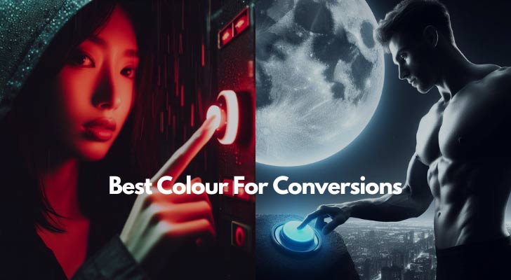
Life's like a rainbow, full of varied hues, much like people's preferences. Each color strikes a different chord with everyone. What works wonders for one might just miss the mark for another.
Ever heard that age-old advice to pick just the right shade for your website's call-to-action button to boost conversions? Many have sung the praises of the psychological impact of colors, suggesting certain hues can magically make users click more.
But let's stir the pot a bit. What if it's not so much about the specific color, but rather about how much it stands out? Sounds a bit more logical, right?
So the idea of a universally "best" colour for conversions? Do you think it's more myth than reality? Because it's all about knowing people as well as knowing about yourself. Diverse as we are, it's the mix and match of colours that truly reflects our tastes. Isn't that right, Dolly?
Did You Know?
- 85% of shoppers say color is a primary reason for buying a product.
- Websites with a dark color scheme can increase growth by 2%.
- Red can increase click-through rates by as much as 21%.
- Blue is the most popular color for both men (57%) and women (35%).
- Green is effective for environmental and outdoor products, boosting conversions by 5% in these sectors.
- Black adds a perception of luxury; luxury product sites see a 29% increase in conversions.
- Orange is an aggressive color that can call to action; landing pages with orange CTAs see up to 32.5% increase in conversions.
The Pink Website Vibe
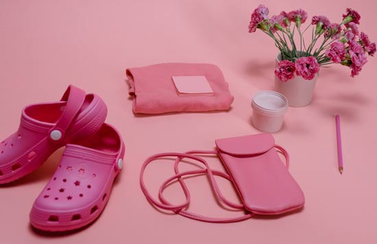
When you land on a pink website, what's the first thing that pops into your mind? For many, it's feelings of softness, femininity, or even romance. Pink, with its various shades from blush to fuchsia, can evoke a range of emotions.
What's in a Color: The Pink Perception
Pink often carries the images of of charm, sweetness, and innocence. Think about the baby showers, Valentine's candies, and cherry blossoms. Here are some perceptions linked to pink:
- Warmth and Care: Pink can feel nurturing and comforting. It's almost like that cozy feeling you get when you wear your favorite sweater, right?
- Playfulness: Brighter shades of pink can inject a bit of fun and quirkiness. Perfect for brands that want to seem more youthful and energetic.
- Modern Femininity: Far from being restricted to stereotypical girly things, today's pink represents modern femininity, breaking away from conventions.
But, Does Pink Convert?
Here's the million-dollar question. As with any color, pink can be a hit or miss. It largely depends on the context. A children’s toy store or a beauty blog might benefit from a pink palette, appealing to its target group. On the other hand, if you’re marketing heavy machinery, pink might not be your best bet.
Did You Know?
- Yellow grabs attention and can increase conversions by 12% for warning messages or clearance sales.
- Pink targets a female audience, increasing conversions by 20% in beauty and fashion sectors.
- 92% of consumers say visual factors are the most influential in purchase decisions.
- Color can increase brand recognition by 80%.
- 42% of online shoppers base their opinion of a website on overall design alone, with color being a major part.
- 52% of users who don’t return to a website cite aesthetics as the main reason.
- 15% increase in pageviews for sites that optimize color schemes to their audience.
The Green Hue: More Than Just Aesthetic
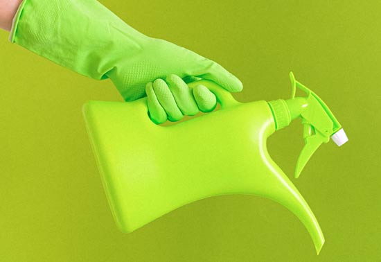
Ever stumbled upon a green-themed website and felt a certain calm wash over you? Green, more than just a color in the palette, carries with it a plethora of meanings and emotions. Let's chat about the vibes a green website might give off and whether it's got the mojo to convert.
Nature and Freshness
Green is nature's favorite child, right? It's reminiscent of rolling meadows, tall trees, and that sense of tranquillity we often get when surrounded by nature. A website donning this hue often feels fresh, organic, and grounded. Think about brands that position themselves as eco-friendly, organic, or sustainable. Green is their go-to, and for a good reason.
Trust and Growth
Financial websites often rock the green shade too, have you noticed? That’s because green can symbolize prosperity, growth, and stability. After all, who doesn't like seeing green numbers on their stock portfolio? It's a subconscious nod to the idea of "in the green" or financial success.
Does Green Convert?
Now, the million-dollar question: Does green have the charm to convert? Like any color, it depends on the context. If you're a tech brand, a neon green might not convey the trust and reliability you want. But if you’re selling plant-based products? A soft sage or olive green might be just what the doctor ordered.
That said, green has had its moments in the spotlight. Ever noticed that a lot of 'add to cart' or 'checkout' buttons are green? This might be because green can signify "go" or progression in many cultures. It subtly nudges the user to proceed without any red (stop) signals.
Orange Websites: Vibrant, Energetic, and Persuasive?
Let's talk about orange. It's not just for pumpkins and citrus fruits. In the web designing, orange can be a bold choice that sends a particular message. But does it make for good conversions?
The Energy of Orange
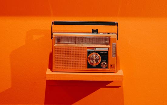
When you land on an orange-themed website, you're often met with a sense of energy and enthusiasm. Orange is lively, dynamic, and invokes feelings of warmth and friendliness. It's the kind of color that's hard to ignore, right? This attention-grabbing trait can be a boon, especially when you're aiming to stand out in a sea of websites.
Associations with Action
Ever noticed how many "Buy Now" or "Sign Up" buttons are orange? There's a reason for that. Orange is often associated with calls to action. It beckons the user, suggesting urgency without the aggressive push that red might have. For many, this color strikes a balance between excitement and approachability.
But, There Are Considerations
Before you go all-in with an orange color palette, here are a few things to consider:
- Overwhelming Intensity: A little orange can go a long way. Too much, and your site could feel a tad overwhelming or even garish. Balance it out with neutral tones or complementary colors.
- Cultural Nuances: Different cultures perceive colors in unique ways. In some places, orange might be linked to affordability, while in others, it can signify creativity or spirituality.
Does it Convert?
Here's the million-dollar question. While orange can be engaging and action-inducing, its effectiveness is closely tied to how it's used. If it aligns with your brand's message and is used thoughtfully, it can indeed boost conversions. However, blindly plastering it everywhere without considering the overall design or the feelings it might evoke in your target market might not yield the results you're hoping for.
Did You Know?
- Changing the color of a CTA button can increase conversions by 14% to 21%.
- 1 in 4 websites uses blue as a dominant color.
- 60% of people decide whether or not they are attracted to a message based on color alone.
- Color influences90% of an initial impression of a product or brand.
- CTA buttons in contrasting colors outperform those in complementary colors by 20%.
- Less than 5% of Fortune 500 companies use more than two colors in their logo, showing the power of simplicity in color choice for branding.
Color's Just One Tool in the Box
When designing a website, we know that colour is undoubtedly one of the players. You notice it, are influenced by it, and it can set the mood for the entire experience.
But let's get real. If colour were the only thing driving website engagement, designers would have it easy. Just pick a trendy palette, splash it across the site, and watch the engagement metrics soar. Sadly, or perhaps fortunately for the art of design, there's a lot more to it. Of course, other elements need to play in harmony:
- Usability: A stunning color palette won't save a site that's hard to navigate. The user experience should be smooth and intuitive. Drop-down menus, clear call-to-action buttons, and easy-to-read fonts all play their part.
- Content: What's a beautiful site without meaningful content? Engaging text, striking visuals, and interactive elements can make or break the user's stay. If the content doesn't match the vibrant colors or isn't displayed in a user-friendly manner, visitors might just bounce.
- Layout and Spacing: Ever been on a website where everything feels cluttered? Even with the best color choices, a messy layout can be off-putting. Proper spacing, alignment, and organization give each design element – including color – room to breathe and shine.
Instant Access
Instant Access
Instant Access
Instant Access
Colors and Emotions
The psychology of color is fascinating, but it's not universal. Cultural, personal, and even situational factors can influence how a color is perceived. For example, red might be associated with danger or stop in some contexts, but it's also the color of love and warmth in others.
Flexibility and Adaptability
Trends come and go. The hot color of today might be the passé shade of tomorrow. Relying solely on color as the driving force of a site's design can leave it feeling dated pretty quickly. Being adaptable and ready to evolve, not just with color but with all design elements, ensures a site remains fresh and engaging.

The Evolution from Button Colours to Big CTAs
Back in the day, the buzz in the design community was all about button colours. "Red buttons convert best!" some would say, while others would swear by the calming allure of a blue button. But the fuss was probably because there weren't heaps of ways to stand out within a blog post or on a static web page.
So what should you actually do instead?
1. Compelling Copy
Good writing sells. It's as simple as that. Before anyone decides to buy, subscribe, or engage, they'll read what you've got to say.
- Headlines that Hook: You've got mere seconds to grab attention. Your headline should instantly communicate value and pique curiosity.
- Benefit-Driven Content: Users want solutions, not features. Instead of saying "Our blender has 10 modes," say "From chunky salsa to velvety smoothies, create meals effortlessly."
2. User Experience (UX) Design
A well-thought-out UX design ensures that visitors don't just land on your site but stay, explore, and convert.
- Ease of Navigation: Ever been on a site where you can't find what you're looking for? Frustrating, isn't it? A clear menu, logical page hierarchy, and breadcrumbs can make the user's journey seamless.
- Page Loading Speed: Waiting feels like a chore. And on the internet, patience is thin. Compress those images, trim the code, and if possible, use a Content Delivery Network (CDN) to speed things up.
3. BIG Call-to-Actions
Sure, colors matter, but what your CTAs say and where they're placed can make a world of difference.
- Visibility: Don't make users hunt for the next step. Whether it's signing up, buying, or reading more, it should be noticeable without being obnoxious.
- Clear Instructions: "Click here" is a tad vague, right? How about "Grab your eBook" or "Start your adventure"? Direct and inviting CTAs are the standard now.
4. Trust Signals
In a world full of online scams, users need reassurance. Show them they're in good hands.
- Testimonials and Reviews: Real words from real people. Showcasing honest feedback from satisfied customers can tip the scales in your favor.
- Security Badges: If you're selling something, users need to trust you with their data. Flaunting security badges and ensuring you have a visible privacy policy can ease those nerves.
5. Personalization
We all like feeling special, right? Tailored experiences make users feel seen and valued.
- Targeted Content: Use data to show relevant product recommendations or articles. If someone just bought hiking boots from you, they might be interested in a blog post about hiking trails.
- Email Segmentation: Everyone's inbox is crowded. Stand out by sending emails that resonate. If a segment of your list are dog lovers, they'd likely appreciate content or products centered around their four-legged friends.

