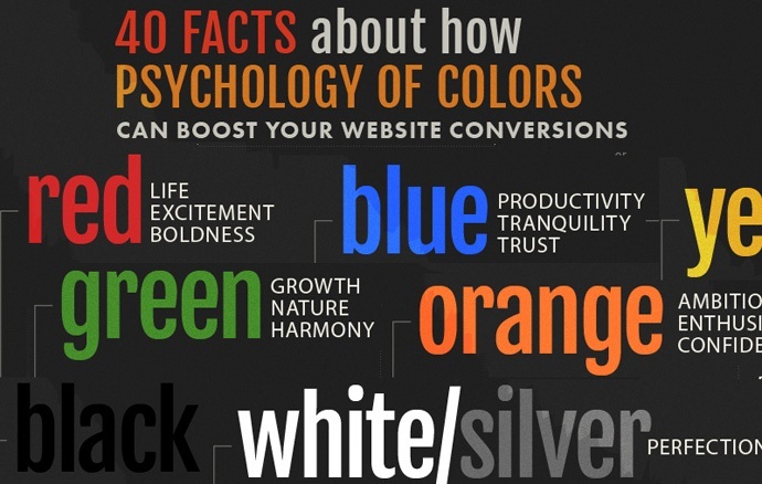
Over the years, continuous research has unveiled a quite surprising truth: color choices can profoundly impact a business’s ability to turn a profit. Be it in your website’s color scheme, logo, or even call to action buttons, these choices can make or break a company. In fact, according to research compiled by DesignAdvisor, color is responsible for up to 80% of a brand’s ability to be recognized. Also, color choices account for 62 to 90% of a potential customer’s assessment of a product. So, paying attention to how color impacts your brand message can fundamentally change how you engage with your audience and potential customers. Here are two significant ways in which color choices affect your brand:

40 Facts About How Psychology of Color Can Boost Your Website Conversions by DesignAdvisor.net
Colors and Brand Message
As mentioned above, color can have an enormous impact on branding. Color psychology helps us understand how this happens: different colors are associated with specific messages and emotions (tranquility, security, elegance, etc.). In this sense, we can say that colors carry meaning. These are not absolute, as color associations can be impacted by an individual’s culture, personal memories and even mood. Regardless, color psychology delineates the basic principles behind color associations, giving brands the ability to convey their branding through their choice of color.
For instance, companies operating in industries where trust is a deciding factor, (think finance or health care) frequently opt for blue since it conveys a sense of authority and tranquility. If, however, a company is trying to shock and generate a strong emotion, red is usually a good choice. Brands such as Coca-Cola, Google, and even John Deere, have mastered the art of color branding, check them out for inspiration!
Colors and Conversion
Color choices are not only relevant when it comes to bigger elements such as logos and branding color schemes. In fact, by switching the color of CTA buttons to more efficient choices, several companies have managed to turn up their revenue. Here, contrast is key. Colors such as red and orange are typically highly contrasting, meaning that visitors’ attention will naturally be drawn to the intended design element.
By simply changing their CTA color to red, Dmix managed to increase conversions by a whopping 34%. Another good example is Performable - the company found that their red button outperformed other highly contrasting colors such as green by more than 20%. So, if you are willing to test out different colors and take the time to explore different options, you could hit a goldmine!
The key here is to understand that the overall picture matters greatly, and there is no single perfect CTA color. If you happen to have a red color scheme, for example, a red button will not call out for attention from viewers, yet a blue one might. As with the previous point about branding, the devil is in the details.
Final Thoughts
These are only two of the areas where color choices can make a difference. If you are smart about it, colors can help you tell better stories, build more engaging websites, and keep your customers happy. Continuing research on the topic will bring new trends and ideas to the table, so be sure to stay up-to-date to make sure that you are using colors in the most cutting-edge ways possible.

Author Bio: Josh Wardini
Community Manager at Webmastersjury Location Incapable Internet Enthusiast | Re-Designer of the World Around | Bodybuilder trapped in a Computer Geeks Body.
