Your storefront needs a hook that grabs immediate attention before text elements register. Human brains process basic visual cues at lightning speed, making initial impressions completely instantaneous. Your selection of shades dictates that early physical reaction entirely. Subtle shifts in background tone completely alter user behavior within few seconds flat.
People form deep opinions about your online store presence within small fractions of a second. Most of that snap decision relies heavily on the hue palette you deploy across banners. Your conversion charts fluctuate based on those silent psychological triggers. Merchants frequently overlook this simple revenue driver completely right today.
Conversion rates shift upward when you modify your primary layout tones on checkout pages. Your company identity lives or dies by the emotional responses you evoke from buyers. Let's dissect the cold science behind those lucrative checkout adjustments. Online competitors will struggle to match your optimized conversion level right now.
Red and the Psychology of Urgency
Blood pressure spikes naturally when human eyes look at intense scarlet elements. Your visitors experience an immediate physiological acceleration when you decorate call-to-action tabs with this fiery hue. Biological wiring connects crimson shades directly to survival instincts and sudden alertness. Online stores exploit this deep-seated human trait to reduce cart abandonment during flash promotions. Crimson signals immediate action without requiring lengthy textual explanations from your sales copy.
Clearance sales yield better results when red banners dominate the digital storefront. Buyers feel a heightened sense of scarcity that overrides normal rational hesitation. Your conversion rates climb because the shade creates a literal fear of missing out. Scarcity messaging pairs perfectly with scarlet tones to force quick transactional choices. Shoppers spend less time debating the financial consequences when urgency fills their field of vision.
Excessive use of scarlet tints will easily ruin your user experience design. Overstimulation makes people feel anxious and pushes them away from checkout screens entirely. You should restrict this aggressive tone to your absolute highest priority links. Subtle placement ensures maximum impact when a user encounters a checkout button. Strategic scarcity applies to color distribution just as much as stock levels.
Ruby red elements on your limited-time discount counters trigger immediate purchase behaviors. Buyers notice the bright digits instantly and feel compelled to complete their checkout process before the clock runs out.
Soft crimson tones on your primary delete or remove links prevent accidental clicks. People automatically slow down because they associate the tint with danger or permanent account changes.
Solid vermilion fills on your main subscription tab boost sign-up metrics dramatically. Your link becomes the focal point of the landing screen and commands prompt user focus.
Blue and the Creation of Trust
Financial institutions select deep sapphire tones to project absolute stability and security. Your clients feel safer entering credit card digits when a calming azure surrounds the input fields. Corporate structures rely on ocean hues to convey dependability and professional competence. Human brains connect blue skies with clear days and low-risk environments naturally. Your website gains immediate credibility when you select an established navy background.
Conversion optimization relies on reducing visitor anxiety during critical choice moments. Cobalt shades lower heart rates and induce a state of serene contemplation. Buyers spend larger sums when they feel zero pressure from the visual environment. Your checkout abandonment drops when security seals utilize a genuine sky-blue backdrop. Peace of mind directly correlates with higher average order values across online retail.
Cold azure tones will sometimes create an unintended feeling of corporate detachment. Excessive pale slate hues make your web design feel sterile and entirely emotionless. Smart designers combine cool tones with warm accent buttons to maintain user interest. Proper contrast prevents your site from looking like a boring utility portal. Visitors remain on your page longer when the corporate serenity feels welcoming rather than icy.
Navy background bars on your user testimonials instill immediate trust in nervous prospects. People read the reviews with a more positive mindset when surrounded by dependable corporate color hits.
Cyan borders around your software payment options increase checkout completion percentages. Shoppers feel more confident during data transmission when the field frames look clean and secure.
Teal highlights on your customer service live-chat bubbles encourage hesitant buyers to ask questions.Help icons look accessible and safe when styled in friendly aquatic shades.

10 Best Color Palettes For Websites
Green and the Signaling of Growth
Environmental awareness and fiscal wealth connect directly to the color green in human psychology. Your digital brand feels sustainable and healthy when emerald tones guide the user interface. People associate olive and mint shades with freshness, organic products, and financial success. Online buyers click confirmation buttons faster when they see a bright lime shade. Your corporate image feels non-threatening and completely ethical under a natural forest canopy.
Action items painted in soft sage tones suggest progress and successful completion. Users feel they are moving forward when green indicates a successfully completed registration step. Your application forms drop in friction when green checkmarks validate correct input fields. Psychological safety increases because green traditionally means permission to proceed in traffic systems. Buyers experience reduced buyer remorse when the final invoice screen features leafy accents.
Darker forest tints sometimes cause associations with stagnancy or heavy military themes. Select your color variant carefully to match your industrial niche perfectly. Bright neon green will quickly cheapen a premium brand if used too generously. Proper saturation control ensures your website looks professional rather than radioactive. Subtle hints of mint work far better than giant blocks of unrefined primary green.
Emerald discount tags on your luxury eco-friendly catalog items boost immediate checkout intent. Buyers feel they are making an ethical investment when natural colors frame the price point.
Olive text highlights on your investment portfolio app reassure users about asset stability. Customers view their wealth accumulation with extra confidence when growth indicators use steady earthy tones.
Mint checkmarks next to your newsletter registration steps decrease form abandonment rates. People enjoy the visual reward of green validation as they complete each required field.
Yellow and the Influx of Optimism
Sunlight and high visibility belong naturally to the vibrant yellow color spectrum. Your landing pages feel energetic and full of hope when gold accents decorate the layout. Attention levels rise immediately because yellow triggers chemical activity in the human nervous system. Window shoppers notice yellow banners from incredible distances due to high visual contrast. Your brand radiates cheerfulness and youthful energy when golden tones are applied correctly.
Caution signs also utilize bright canary yellow to flag potential safety hazards. Your users feel a subconscious urge to slow down and analyze the surrounding space. High-contrast yellow elements command fast focal adjustment from the human eye during browsing. Web designers deploy banana shades on secondary call-to-action boxes to win extra glances. Buyers absorb promotional details much faster when text sits on a sunflower backdrop.
Too much gold saturation will easily cause massive eye strain and screen fatigue. Visitors abandon web pages rapidly when background colors scream for attention aggressively. Pair bright sunny hues with dark charcoal text to preserve absolute readability. Light amber accents function best when confined to minimal notification icons or star ratings. Massive yellow expanses create an impression of cheap discount stores rather than premium services.
Bright amber alert frames on your software dashboard highlight urgent feature updates. Users read the notifications immediately because the hue contrasts sharply against standard dark backgrounds.
Gold stars next to your product review sections increase conversion confidence instantly. Buyers associate the warm metallic shade with top-tier performance and reliable merchandise.
Canary yellow checkout sidebars draw attention to special package upgrades during checkout. Customers select add-on options more frequently when the upgrade path looks bright and rewarding.

Orange and the Spirit of Aggressive Selling
Action-oriented brands choose fiery orange tones to command immediate user interaction. Your sales buttons radiate warmth and high energy when dipped in tangerine shades. People see orange as a friendly yet highly assertive color statement on desktop monitors. E-commerce platforms utilize coral tones to stimulate impulse buys among hesitant cart holders. Your conversion metrics rise because orange combines the urgency of red with the cheer of yellow.
Subscribers sign up faster when registration boxes use an energetic ginger trim. The eye gravitates toward copper tones because they slice through standard white layouts cleanly. Your digital platform gains a playful spirit that eliminates corporate stuffiness and coldness. Creative software companies employ apricot variants to look innovative and accessible to novices. Rapid growth occurs when your design feels welcoming instead of intimidatingly technical.
Cheapness remains a major risk when orange dominates your web layout excessively. Poorly selected rust shades make your digital storefront look like a low-budget liquidation center. You should restrict deep copper hits to primary transaction triggers or free trial links. Clever placement ensures the tone motivates action instead of causing aesthetic irritation. Refined use of ginger accents elevates your conversions without compromising brand value.
Tangerine buy buttons on your SaaS pricing tables drive higher click-through percentages. Shoppers perceive the trial option as a low-risk opportunity when framed in warm energetic hues.
Coral free-shipping banners at the top of your webpage keep buyers exploring inventory. Visitors stay aware of the extra financial incentive throughout their entire digital store session.
Ginger icons on your software download links accelerate immediate user adoption rates. People identify the active installation files instantly against text-heavy documentation pages.
Purple and the Aura of Luxury
Royalty and high-end exclusivity link historically to the deep amethyst color spectrum. Your premium services feel far more elite when plum tones dominate the branding scheme. Wealthy consumers associate purple with superior craft, wisdom, and rare quality standards. Online agencies choose orchid hues to separate themselves from generic low-cost corporate competitors. Your brand equity climbs when your digital assets project a noble and sophisticated presence.
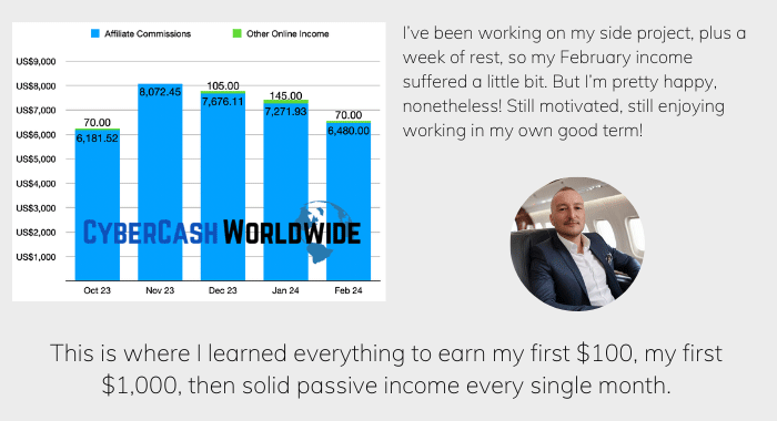
How I "Finally" Make Over $7,000 Monthly Income
"The most valuable thing I've ever done!"
Creative businesses employ lavender shades to spark original ideas and artistic feelings. Your consulting landing pages look mystical yet highly authoritative under an eggplant tint. Buyers anticipate paying premium prices when luxury colors frame your product descriptions. Conversion metrics improve because purple suppresses the urge to look for cheap alternatives. Users perceive your services as specialized solutions that justify a substantial financial investment.
Excessive use of violet often makes your website look arrogant or strangely eccentric. Mainstream retail buyers sometimes pull back if the color scheme feels too aloof. You should deploy regal shades sparingly on key checkout elements or premium plan badges. Careful distribution preserves the sense of luxury without alienating budget-conscious website visitors. Success relies on matching your deep lavender accents with clean white space.
Amethyst badges on your higher-tier subscription columns pull focus toward high-margin items. Affluent users select the premium plan more often when it looks visually elite.
Plum typography for your luxury product titles communicates exceptional heritage and worth. Shoppers tolerate higher retail costs because the text presentation feels heavy and established.
Lavender background accents on your cosmetic store checkout forms lower transaction friction. Buyers connect the soothing floral hue with self-care and indulgent lifestyle choices.
Black and the Minimalist Path to Conversion
Sophistication and timeless power emanate directly from solid black brand palettes. Your high-end electronic items or designer apparel look incredibly sleek against dark screens. Affluent shoppers respond positively to dark tones that mimic luxury retail environments. Online stores drop colorful distractions entirely to focus the user eye on product imagery. Your brand message gains immense clarity when black frames your digital catalog.
Contrast values reach their absolute peak when white text sits on dark charcoal backgrounds. Users read product specifications with total clarity due to the extreme visual definition. Your conversion rates increase because the layout forces focus onto the checkout path. Premium brands use jet-black buttons to represent mystery, authority, and ultimate product refinement. Visitors hesitate less when the presentation feels clean, direct, and completely un-cluttered.
Gloomy websites often drive people away by looking depressing or accidentally sketchy. Designers avoid pure black text on deep grey boxes to prevent heavy eye strain. Crisp white borders save your dark layout from blending into an unreadable puddle. Smart choice of charcoal tints ensures your site stays accessible to everyone. Conversion rates plummet if users feel they are exploring a hidden corner of the web.
Jet-black buy buttons on your white luxury store layout command immediate authority. Shoppers view the product as a premium asset when the click target looks bold and decisive.
Charcoal backgrounds behind your high-definition electronics photos make product colors pop intensely.Customers analyze physical details much better due to the extreme dark contrast framing.
Onyx header navigation menus clean up your e-commerce storefront structure immediately. Visitors browse your store categories effortlessly because the layout links look distinctly separated.

White and the Psychology of Clean Space
Clarity and high efficiency define websites that leverage massive amounts of white space. Your product pictures stand out when a spotless ivory canvas wraps around them. Consumers connect clean backgrounds with premium organization, hygiene, and high-quality operations. Online platforms utilize snowy whitespace to reduce the cognitive load on tired website users. Your corporate message sounds far more honest when it breathes inside an open layout.
Checkout pathways become far more successful when you eliminate busy sidebars entirely. White backdrops ensure that user eyes stay fixed on the payment input box. Your conversion success climbs because there are zero visual traps to derail buying intent. Tech innovators use immense blank space to highlight their premium hardware features. Simplicity drives immediate action because it removes the choice paralysis that ruins online sales.
Excessive blank space often makes your software company look unfinished or empty. Visitors feel lost if a website lacks clear visual paths or text anchors. You should anchor large white layouts with dark text and colorful transaction zones. Proper spacing separates items without making your brand look cold and abandoned. Success comes when you treat empty space as a deliberate layout frame.
Generous white padding around your checkout buttons prevents accidental fat-finger clicks on mobile devices. Mobile buyers complete orders faster when the click targets sit in clean isolated space.
Spotless alabaster backgrounds behind your software feature lists improve text readability dramatically.Users digest complex operational benefits without experiencing fast mental tiredness or visual overload.
Blank margins on your landing pages guide user eyes downward toward your primary newsletter box.Visitors follow the natural open flow straight into your main lead capture field.
Pink and the Stimulation of Niche Conversions
Gentle pink palettes trigger instant emotional associations with romance, sweetness, and gentle care. Your digital storefront looks welcoming and highly accessible when rose tones soften the edges. Niche businesses utilize magenta shades to stand out from dull blue corporate competitors. Online shoppers view bubblegum hues as playful, compassionate, and deeply non-threatening. Your brand develops a friendly personality when you inject pink accents into the layout.
Conversions climb when bakeries or health brands employ blush tones on subscription bars. Buyers feel a sense of comfort that reduces transactional defense mechanisms naturally. Your sign-up metrics experience positive shifts due to the inviting nature of the shade. High-energy fuchsia buttons command immediate focus without generating the panic response of red. Shoppers react with enthusiasm when a vibrant pink highlights special bonus products.
Over-saturation of neon pink often alienates buyers outside your core demographic. Barbie-like tints sometimes make a professional software company look immature or unprofessional. You should mix soft rose tones with dark charcoal anchors to maintain authority. Thoughtful layouts keep your brand looking expert while retaining a welcoming vibe. Subtle use of coral-pink guarantees a fresh appearance without sacrificing corporate trust.
Fuchsia buy links on your wellness portal highlight premium membership options vividly. Users click the energetic tint because it feels upbeat and promises positive lifestyle upgrades.
Blush pink borders around your checkout testimonials soften the final financial request. Shoppers read peer reviews with a relaxed attitude when gentle tones frame the text.
Rose gold accents on your luxury watch catalog convey contemporary elegance and style. Customers purchase high-ticket merchandise more readily when the accents feel stylish and upscale.
Brown and the Grounding of Brand Reliability
Earth tones project an immediate sense of honest work, durability, and deep history. Your agricultural or outdoor goods look deeply dependable against chocolate backgrounds. People view coffee and tan shades as stable, organic, and completely down-to-earth. Online merchants employ espresso tints to evoke warmth and artisanal quality standards. Your corporate style wins trust by avoiding flashy colors that look cheap or deceptive.
Conversion optimization improves when organic brands drop sterile grey for rich chestnut. Buyers feel an emotional connection to traditional craftsmanship and real physical products. Your checkout screens feel cozier and safer when sepia details surround the fields. Footwear and apparel stores boost sales by framing items with warm mahogany borders. Shoppers slow down to browse longer when the visual palette feels wholesome.
Excessive use of dark mud tones often makes your web store look dirty or outdated. Visitors leave quickly if a page feels heavy, dark, and poorly lit. You should pair deep tan bases with creamy white space to maintain crisp contrast. Smart color distribution guarantees an earthy feel without sacrificing a crisp corporate look. Success depends on using wood-colored accents as deliberate anchors rather than massive background walls.
Walnut product cards on your coffee subscription page emphasize rich heritage. Buyers invest in monthly plans more frequently when the layout feels artisanal and premium.
Tan background banners on your leather goods catalog elevate perceived product value. Shoppers associate the warm hide colors with high-quality materials and durable craftsmanship.
Copper-brown subheadings on your organic food store improve reading flow. Customers navigate through nutritional facts smoothly because the text color looks completely natural.
The Isolation Effect and Button Conversions
Visual distinctness plays a massive role in steering consumer choice across landing pages. Your primary purchase links must pop out from the rest of the layout. Human brains automatically notice the single odd element in a sea of uniformity. Behavioral scientists call this phenomenon the Von Restorff effect or the isolation rule. Your conversion rates spike when your action button uses a completely un-used hue.
Contrast determines if a prospect sees your primary register link within three seconds. A green button on a green layout disappears completely from the user's focus. Select an accent shade that sits opposite your background color wheel to win attention. Complimentary colors create a natural visual collision that forces immediate ocular adjustment. Shoppers click links faster when the layout leaves no doubt about where to go.
Cluttered pages destroy the isolation effect by presenting too many competing flashpoints. Visitors experience immediate analysis paralysis when ten different color buttons scream for clicks. You should reserve your highest contrast accent tone exclusively for the checkout link. Monochromatic background systems make your lone colorful button look incredibly prominent. Strategic color isolation removes guesswork and streamlines the path to a final sale.
Lime green buy tabs on a deep navy corporate website capture immediate eyeballs. Shoppers spot the glowing target instantly against the calm dark background.
Vibrant orange download blocks on a clean white tech blog pull massive clicks. Users identify the action path immediately because the bright shade slices through whitespace.
Bright yellow checkout boxes on a muted slate layout maximize immediate revenue. Customers advance through the checkout funnel faster when the action step glares out clearly.
The Impact of Background Tones on Text Readability
Text readability directly influences how long a visitor remains on your service page. Your prospects abandon checkout paths when poor text contrast causes immediate physical fatigue. Dark text on light backdrops remains the gold standard for long-form reading comfort. Human eyes adapt faster to clear stark definitions than to complex multi-colored text blocks. Your sales arguments lose power when users struggle to scan through feature lists.
Reverse contrast configurations utilize light white typography layered over deep charcoal panels. Software developers prefer this dark mode layout to reduce screen glare at night. Your mobile users enjoy better battery life and less optical strain under dark systems. Long sales letters perform poorly in reverse contrast because paragraph blocks look too dense. Content creators alternate background tints to break up long scrolling pages into bite-sized segments.
Bright primary colored backgrounds make long blocks of text completely impossible to read. You should never place detailed product descriptions over a solid red or yellow field. Severe color patterns create visual noise that hurts the eyes within seconds flat. Web masters use clean cream or off-white backdrops to keep readers focused comfortably. High sales metrics depend on effortless comprehension of your primary offer details.
Charcoal typography on an off-white background ensures perfect article readability. Visitors consume your educational sales materials without encountering quick fatigue.
Pure white text inside your dark sapphire checkout headers keeps labels sharp. Buyers fill in shipping details accurately because the field headings stay completely legible.
Soft grey text on bright colored alert strips tones down visual harshness. Users read the urgent error messages without feeling attacked by overly bright layouts.
Cultural Differences in Color Interpretation
Global commerce requires an deep appreciation of local color traditions and taboos. Your localized landing pages face conversion drops if colors carry negative regional meanings. Western markets view white as pure, whereas eastern regions connect it with funeral rites. Online brands face backlash when they deploy insensitive color palettes across foreign store mirrors. Your revenue depends on localizing your color choices just like your text translations.
Financial sites in western countries use green to signal stock price gains. Asian markets often utilize bright crimson to indicate ascending market values instead. Your global advertising campaigns require extensive demographic research to prevent massive conversion blunders. Buyers respond to cultural training that shapes their perception of corporate digital schemes. National heritage alters how a user reacts to your primary promotional banners.
Ignorance of regional color meaning will quickly destroy international growth plans. You should consult local design experts before launching products in new foreign territories. Safe neutral options like high-contrast navy work well across most international web sectors. Proper research ensures your business looks respectable and professional in every hemisphere. Success across global markets demands careful adjustment of your core color rules.
Red accent graphics on your Chinese storefront mirror attract massive festive buyers. Shoppers view the crimson shade as a symbol of luck, wealth, and impending success.
White whitespace borders on your Japanese e-commerce platform project ultimate minimalist luxury.Customers connect the clean open spaces with high-end craftsmanship and absolute corporate purity.
Saffron yellow headers on your Indian retail service portal boost user alignment. Buyers associate the rich golden tone with auspicious events and trustworthy retail transactions.
Seasonal Color Shifts and E-Commerce Conversion
Consumer mood patterns change dramatically as the natural calendar transitions throughout the year. Your promotional sales materials convert better when they mirror current seasonal weather palettes. Winter shoppers respond well to deep icy blues and cozy metallic silver accents. Online platforms update their homepages to reflect the natural rhythms of the external world. Your digital store stays fresh when your layout tones match consumer atmospheric expectations.
Spring marketing demands soft pastel greens and sunny daffodil yellow highlights. Buyers feel a sense of renewal that encourages fresh lifestyle purchases and upgrades. Your conversion rates climb when the visual environment matches their seasonal optimism perfectly. Autumn campaigns perform exceptionally well when deep rust, amber, and olive tones dominate. Retailers capture extra holiday revenue by adapting their skin decorations to festive expectations.
Static color systems make your digital storefront look neglected or completely out-of-date. You should implement a flexible style guide that allows quick holiday theme modifications. Rapid shifts prevent your regular buyers from developing deep website layout blindness. Proper execution keeps your checkout paths feeling vibrant, timely, and actively maintained. Revenue growth thrives when your color schedule coordinates with major retail shopping events.
Pastel mint green headers on your April subscription pages boost spring sign-ups. Buyers connect the fresh organic hue with new beginnings and personal improvement plans.
Deep amber borders on your November checkout carts maximize holiday checkouts. Shoppers feel a sense of festive warmth that stimulates seasonal gift buying habits.
Silver metallic frames on your December premium product pages justify higher prices. Customers view the items as ideal luxury presents due to the frosty festive styling.
Color Accessibility and Inclusive Design Rules
Millions of internet users browse digital spaces while living with color vision deficiencies. Your sales funnel loses revenue if color-blind shoppers cannot read your checkout buttons. Red-green color blindness remains the most common variant affecting global retail consumers. Online systems must ensure high contrast values independent of precise hue selections. Your company reputation grows when you prioritize readable text layouts for everyone.
Designers utilize specialized software to simulate how color-blind buyers view landing screens. Contrast ratios should meet strict international standards to guarantee legible text presentation. Your conversion metrics rise when links do not rely solely on color codes. Added underlines on active text anchors provide a secondary cue that aids immediate navigation. Buyers complete forms faster when error states use both descriptive icons and red borders.
Total disregard for accessibility rules exposes your business to legal risks and lost sales. You should run regular automated tests to verify your background contrast scores. Text elements require a high definition ratio against surrounding layout colors. Proper color choices protect your brand from alienating large segments of the public. Success lies in making your transaction path completely clear for every consumer.
Thick underlines on your primary blue text links help color-blind users identify anchors. Shoppers locate navigation pathways easily without relying entirely on hue differentiation.
High-contrast borders on your form fields clarify input errors immediately. Customers fix typo mistakes faster when distinct shapes back up the alert colors.
Monochrome symbols next to your product stock numbers prevent confusion. Buyers verify item availability correctly even if they struggle to distinguish red from green tags.
Conversion Rate Optimization Testing Methods for Hues
Split testing remains the most scientific way to determine your ideal brand colors. Your personal aesthetic preferences matter far less than live user behavioral data. Quantitative metrics show exactly how real shoppers react to color changes on buttons. Online merchants run simultaneous page variants to discover the highest-performing color combinations. Your checkout flow becomes highly optimized when you listen to real conversion statistics.
A/B testing software isolates individual color adjustments while keeping other elements completely identical. Users remain unaware they are participating in a color optimization experiment during browsing. Your conversion tracking pixels record every single click with total scientific precision. Data analysis reveals which background hue retains visitors for the longest duration. Smart merchants rely on empirical revenue charts rather than subjective design opinions.
Small adjustments in button brightness often trigger massive shifts in transaction totals. You should test one individual color variable at a time to keep results clear. Total isolation of color changes ensures you know exactly what drove the conversion lift. Proper documentation prevents your optimization team from repeating failed color experiments. Success requires continuous verification because consumer taste shifts over extended time horizons.
Red versus green button tests on your landing pages clarify immediate local preferences. Shoppers reveal their true behavioral instincts through real-time click volume numbers.
Light versus dark mode comparisons on your software platform uncover user habits. Customers show which background system maximizes session duration and feature interaction.
High-contrast header variations on your checkout screen reduce cart abandonment trends. Buyers advance through the transaction steps faster when the navigation bar looks ultra-clear.
How Does Color Impact Branding and Conversions?
Your digital style choices dictate how buyers interact with your brand catalog every single day. Selective use of psychological hue triggers boosts your sales metrics without changing your product features. Proper color distribution ensures that your main checkout links get noticed by online prospects within few seconds flat right now.
Continuous empirical monitoring remains the safest method to verify your layout modifications over time. Shoppers reveal their true purchasing preferences through live database click counts instead of feedback surveys. Data analytics should guide every single modification you make to your storefront appearance. Competitors lose ground when you optimize things scientifically.
Small visual improvements combine to build major shifts in your net profit margins. Growth depends entirely on building clear text links that separate themselves from surrounding layout elements. You will secure higher transaction volumes by placing smart hue selections across your entire commercial site. Your online optimization rewards look massive.
(Real Time) Affiliate Income Report Last Month