How to Triple Your Conversion Rate
(by Using Beautiful Landing Pages)
List 3 Attention-Grabbing Things that Set Your Product Apart:
- Describe the most important thing that your product does for your customers.
- Mention a benefit that only you offer and that your visitor can't get from a competitor.
- These points won't convince someone to buy right away, but you'll get your visitor's full attention.
Now that You've Got their Attention, it's Time to Talk About the Problem...
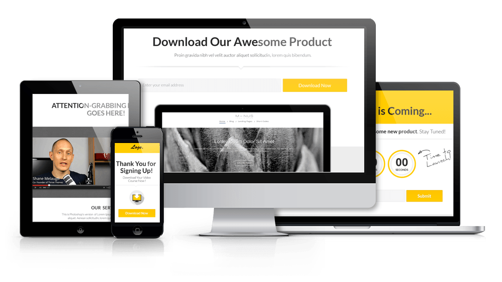
On this sales page, we're not beating around the bush. Right at the top, there's a product image and some points that set your product apart. However, even though this is a very product-focused page, keep in mind that people buy solutions, not products.
With that in mind, use this text section to describe the problem your ideal customer has. Some frustration that might arise from using a competing product, for example.
The most important point here is that you can relate to the problem that your visitor is trying to solve.
“Use a quote like this to add some visual variety to the text section - and to make an important point. The way the text is highlighted means it will get more attention than the regular paragraphs.”
How much time you want to spend on the pain points your visitor experiences depends on the product you're selling. For this template, we're going to transition from problems to solutions after just a short text section.
By choosing us you’ll get the following benefits:

"A testimonial like this can really boost sales..."
"Adding testimonials for social proof is usually a good way to increase conversions. This is still early on in the page, so we're just adding one short (but powerful) testimonial before moving on to some more sales material."
This Text Section is an Element You Can Repeat Several Times on Your Sales Page
"Another example of a quote used to highlight some text."
Use this section to briefly describe a real example of how your product can lead to a specific result. Think of it as a mini case study, that adds an element of proof to the claims you make when talking about the features and benefits of your product.
The text section consists of a subheading, some paragraphs of text and occasional text highlights. You can repeat these same elements multiple times, whenever you need a few paragraphs to explain a specific feature or go into more details about some aspect of your offer.
Use these Sections for Your Product's Features
"Large images add a tangible component to your product description."
Each one of these sections consists of a subheading, some text, a large image and a button. These sections turn dull features into eye-catching highlights and they're especially good for showing off screenshots from your product in action.
Stylish Zig-Zag Layout to Keep Visitors Engaged
We've listed these five points in a zig-zag layout, alternating the sides image and text are shown on. This is a good way to avoid visual monotony and keep the page interesting.
- The same idea applies to your text elements - use paragraphs, highlights and bullet points to keep things interesting.
- The two things to keep in mind are to get your important points across and to make your content easy to consume.
Background Images, Screenshots & More
The images used in this template are background images. The original size is 777x637px.
The layout works very well with screenshots. This could be screenshots of your member's area, your software app or even screenshots of pages in a downloadable PDF. Other kinds of images work as well, though.
Link to More Information or Demo Videos
We've added a "Read More" button to each of these sections. For software products, there's a great opportunity to link each of these buttons to a video that demos the feature you describe in the section.
For more complex product, you might also want to link to a page with a more in-depth explanation of each feature.
For less complex products, you can also simply remove the button.
The Perfect Number of Sections?
In this template, we have 5 sections, but you can easily change that number by deleting or duplicating the sections.
There is no "right" or "perfect" number of sections to use. It's worth testing a longer page, where you list many features/benefits against a shorter one, where you only highlight the highest value features and keep the list short.
"Here's a Template for a Testimonial With No Image..."
"You can use this testimonial example if you don't have an image of the testimonial author. Whenever possible, it's recommended that you get an image to show along with the testimonial, though. It goes a long way to adding more credibility."
What You’ll Get...
The purpose of this section is to make the product you're offering as tangible as possible:
"Show Me Exactly What I'll Get & I'll Be More Likely to Buy It."
Use an image to visualize your product. Even if it's completely digital, the more you can relate your product to real world objects (books, electronic devices etc.) the more tangible it will seem.
Use this highlighted text section to describe your product and add a call to action: tell your visitor why they need to make the purchase right now.
Get Instant Access to Our Product!
Use this text and the above headline for a clear call to action along the lines of: click the button
below to get instant access to [product name]!

100% Satisfaction Guarantee

Secure Checkout

"More Testimonials!"
"Once again, we're moving to testimonials, to add proof and appease your visitor's worries about making a purchase. As you can see, testimonials are used generously on this page, so the more you can get, the better."

"Proin gravida nibh vel velit auctor lorem quis bibendum..."
"This is Photoshop's version of Lorem Ipsum. Proin gravida nibh vel velit auctor aliquet. Aenean sollicitudin, lorem quis bibendum auctor, nisi elit consequat ipsum.nec sagittis sem nibh id elit (Duis sed odio sit amet nibh vulputate)."

"Aenean sollicitudin, lorem quis nibh id elit."
"Sed non neque elit. Sed ut imperdiet nisi. Proin condimentum fermentum nunc. Etiam pharetra, erat sed fermentum feugiat.
Velit mauris egestas quam, ut aliquam massa nisl quis neque. Suspendisse in orci enim. Etiam pharetra, erat sed fermentum feugiat, velit mauris."
Another Text Section: This One is for Addressing Objections or Adding Urgency
We've already called visitors to purchase once and we're getting closer to the end of the sales page. The best use of a text section at this point of the page is to either address your visitor's objections (any reasons why they might hesitate to buy) or add a sense of urgency.
Describe why the decision to purchase should be made now, not later. What will your visitors miss out on, if they hesitate and leave the page? Anyone still reading is probably concerned about the cost of your product. Remind them that there is also a cost to not taking action and not making use of your excellent product.
You've already spent a lot of time selling visitors on the many benefits of your product, so at this point, you can start emphasizing the drawbacks for NOT using your product.
Summary of What You’ll Get...
Get Instant Acces to Our Product!
This section is a repetition of the "buy now" section from above. Feel free to use the exact same call to action again.

100% Satisfaction Guarantee

Secure Checkout
30 Day No Questions Asked Money-Back Guarantee
You are fully protected by our 100% Satisfaction-Guarantee. If you don't increase your website's conversion rate or revenues over the next 30 days, just let us know and we'll send you a prompt refund.

"In this quoted text, you can make a personal promise or personal guarantee, to give more weight to the guarantee statement above."

